Identity · Voice · System
Brand
The visual and verbal language of William W. Anderson III Architecture. A standard, not a style guide.
The Mark
A frame, and a horizon
The mark is two lines of the practice: the square (every image is matted, every room is framed) and the horizontal bar at two-thirds height (living with the horizon). Drawn at a consistent 1px stroke. It is the smallest possible summary of the work.
Primary, on white
Inverse, on dark
Navigation, 28–32px
Minimum size: 20px. Clear space: at least half the height of the mark on every side. Do not fill, rotate, recolor outside of the stone palette, or add effects.
Wordmark
Option A · Uppercase, tracked
William W. Anderson III
William W. Anderson III
Option B · Title case
William W. Anderson III
William W. Anderson III
The wordmark is the full legal name set in Inter Light, on one line, always. Two acceptable treatments: uppercase with 0.2em tracking, or title case with natural letterspacing. It is never abbreviated to initials, never set in a weight heavier than Light, and never wrapped to a second line.
Palette
Six tones of stone, plus white
Stone 900
#1C1917
Primary text, titles
Stone 700
#44403C
Body copy
Stone 500
#78716C
Secondary copy, captions
Stone 200
#E7E5E4
Borders, dividers
Stone 50
#FAFAF9
Surfaces, matte
Off White
#FFFFFF
Frame, negative space
Typography
Inter, three weights, used quietly
Display · 200 · Extralight
A house above the fog line.
Heading · 300 · Light
Designing for the California coast and beyond.
Body · 400 · Regular
The palette is restrained. White cladding, dark trim, simple volumes. Glazing details dissolve the wall at the moments that matter most. The landscape does the work.
Caption · 500 · Medium · Tracked
Architecture · Ventura · Los Angeles
The Frame
Every image is matted
Hero imagery is presented inside a generous white frame, like a museum print, with a small placard beneath stating subject and location. This is the signature of the brand.
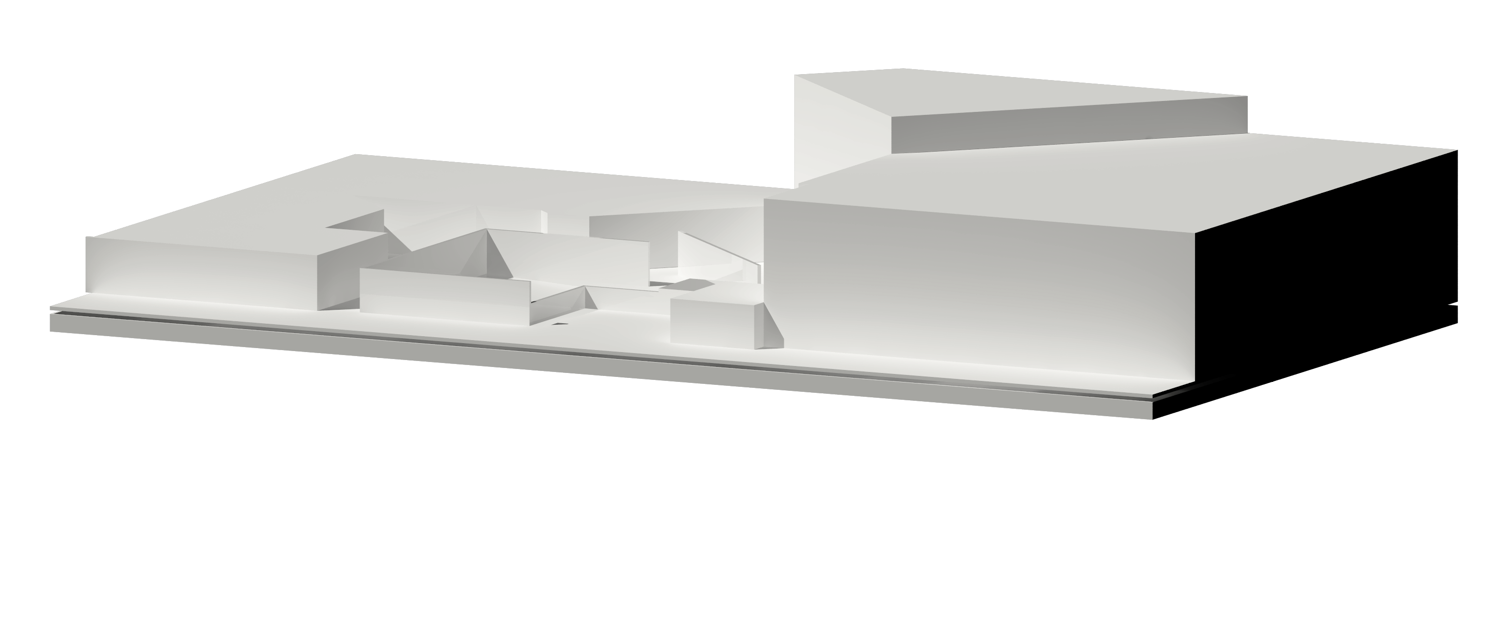
Urban Garden, final model
Downtown Los Angeles · 2018
Principles
Four convictions
01
Restraint over decoration
Every element earns its place. White space and silence are tools, not absences.
02
The frame, not the noise
Each image is presented as if matted in a gallery: generous white margin, museum-style placard, the work allowed to speak.
03
Climate, place, hand
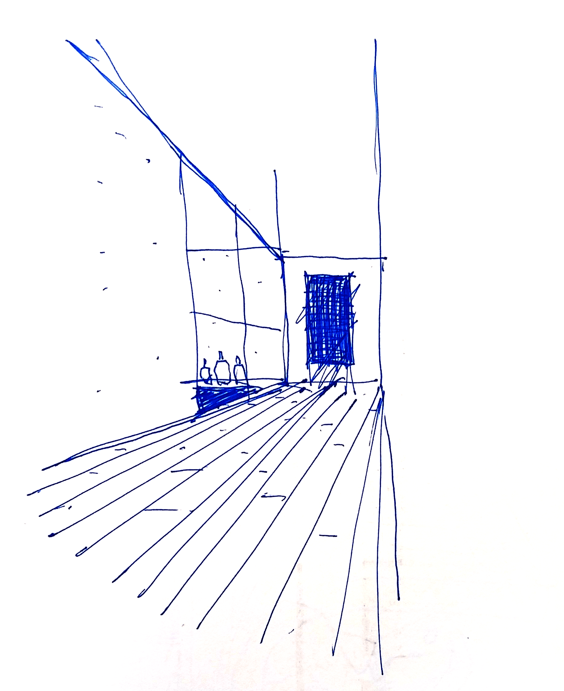
Materials are regional. Drawings are made by hand before they are made by software. The site dictates the geometry.
04
Quiet authority
Voice is observational, not promotional. Adjectives are rare. Verbs do the work.
Voice
Observational. Specific. Quiet.
The voice describes what is, not what is impressive. Sentences are short. Light, shadow, material, and orientation appear more often than adjectives like stunning or unique.
“Living with the horizon, between the sky and the hillside.”
“Deep shadows convey those seen in the surrounding mountain faces.”
“Connectivity with the outside, toward the view, and toward a garden forecourt at the entry.”
“A series of diagonal cuts intersect to form courtyards.”
“Walls reflect the changing sky above, bringing serenity to downtown.”
Motion
Architecture in time, the second register
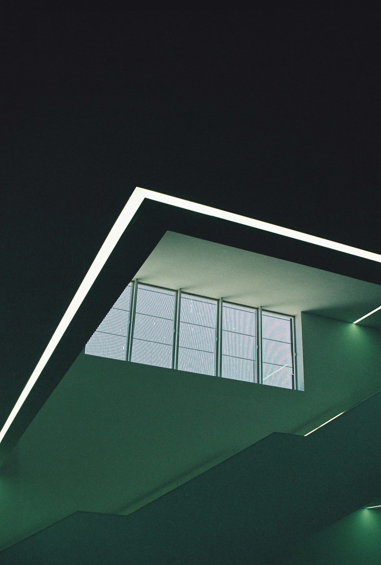
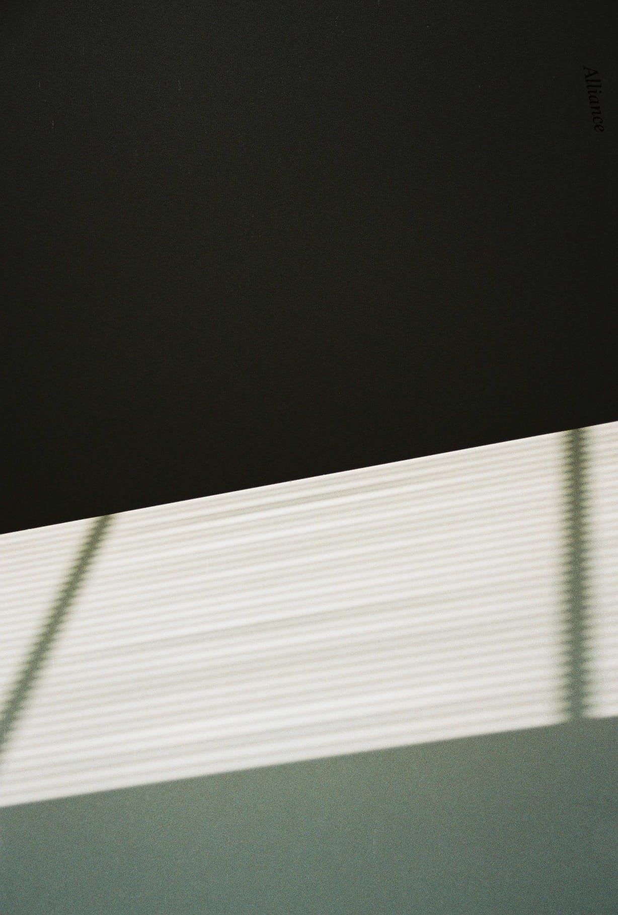
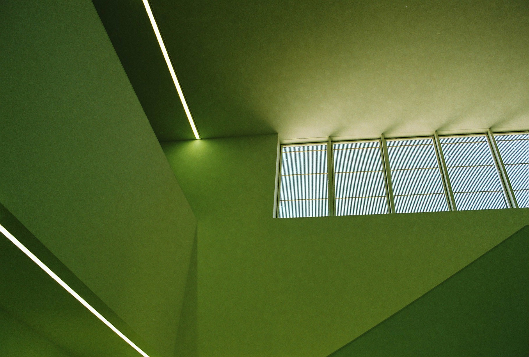
Motion is reserved for the hero. Loops are silent, slow, and locally anchored — light moving across a wall, jacaranda in coastal wind. They run as ambient texture, never as performance. Used as full-bleed backdrops for editorial headers; copy sits over a soft black wash.
Light, interior
editorial-good · about
Jacaranda, coastal wind
editorial-jacaranda · services
LoopAlways silent, autoplay, looped. Never with controls visible.
WashLayer a vertical gradient (black/15 → black/5 → black/55) for legible copy.
UseEditorial headers only. Not on portfolio, not on inner pages.
Imagery
Hand and eye, the brand’s source material
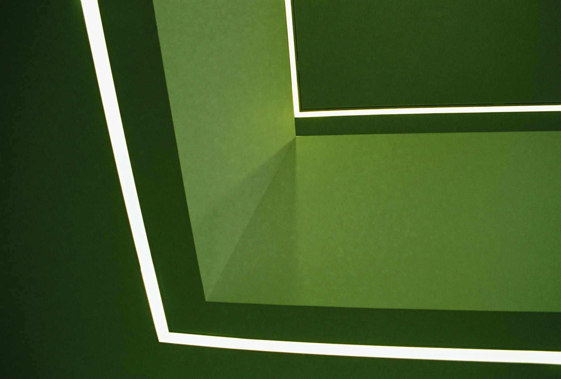
Sketches, travel studies, and film photography form the visual foundation. They are not decoration. They are the record of looking that precedes every project.